Training Intensity Reports
With Analytics, you can track and review the intensity of each of your recorded rowing workouts and create a summary report that contains training statistics for the full season. This is very useful for controlling training intensity and periodization.
Before we get into the intensity report though, we need to understand the workout intensity diagram in Analytics.
Workout Intensity Diagrams
Each recorded rowing session on the logfiles list features a “donut”-style intensity diagram.
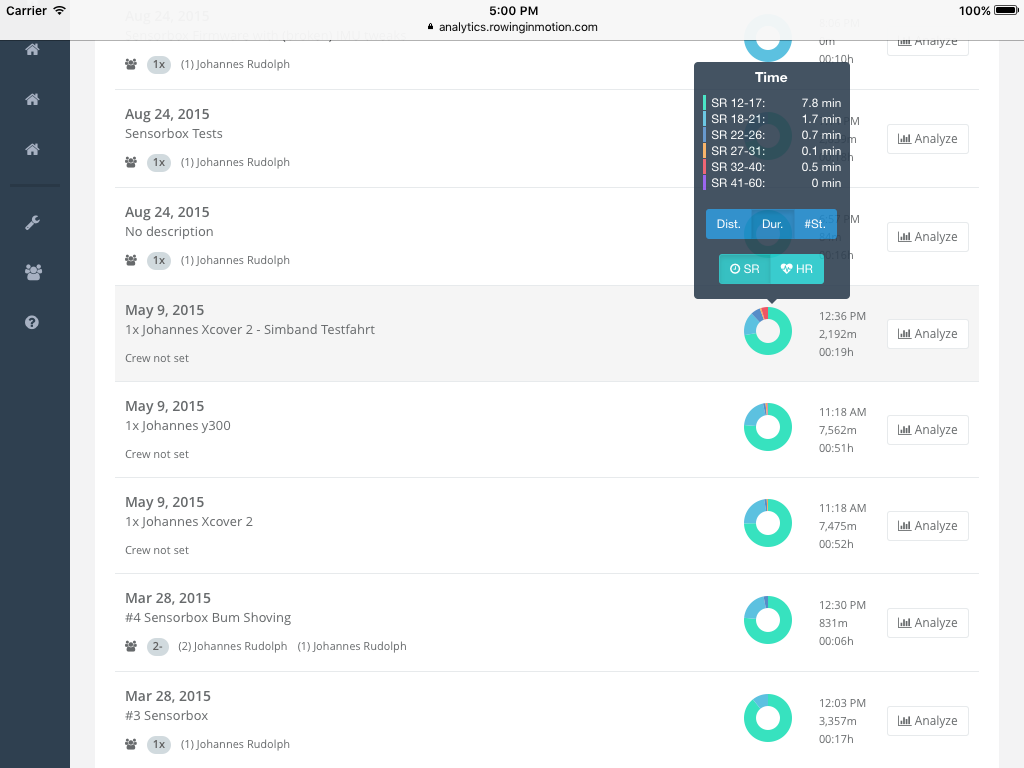
The “donut” diagram is a histogram and by default it shows the proportion of time spent in each intensity zone.
Tip
These intensity diagrams are very useful for finding a specific logfile in the list with a specific exercise content (e.g. multiple 500m pieces at competition intensity).
The Histogram
Let’s look at the diagrams in more detail. We assign each rowing stroke in a rowing session to the corresponding intensity zone and then aggregate for each intensity zone the time, distance and number of strokes. The intensity histogram “donut” shows the proportion of each intensity zone to all other intensity zones in that logfile, starting with the lowest intensity zone at 12 o’clock and then moving clockwise.
Tip
You can click on a the donut-diagram to show a tooltip with the data presented in a table.
Using the selector buttons on the tooltip you can change the aggregated metric, available options are Distance, Time, Strokes.
Intensity Zones
There are two types of zone definitions available: Stroke-rate and Heart-rate (currently Athletes with RiM for Teams only). You can switch between these two types of histograms using the SR/HR selector button.
Stroke-rate based
Stroke-rate typically correlates well with total power generate and is easily available without requiring athletes to wear a heart-rate sensor. While there may be variations between the work-per-stroke between crews (and boat classes) and consequently some crews preferring higher or lower stroke-rates, these variations are typically in the range of +/-2 strokes. We thus chose the following 6 intensity zones, which we found correspond well with traditional training intensity measures:
- SF 0-17: Rest or recovery. Heart-rate typically below aerobic threshold.
- SF 18-22: Steady state. Heart-rate typically near aerobic threshold.
- SF 23-26: Intensive endurance. Heart-rate typically between aerobic threshold and anaerobic threshold.
- SF 27-31: Highly intensive endurance. Heart-rate typically above anaerobic threshold.
- SF 32-40: Competition specific performance. Maximum 2000m race performance.
- SF 40-60: Power > 2000m performance.
The definition of above intensity zones matches very well with the data samples we have at hand and many years of coaching experience we consulted.
Heart-rate based
Heart-rate based intensity analysis is a very useful measure for metabolic load. However, working with heart-rate data requires individual intensity zone definitions derived from a properly executed scientific test involving lactate measurment. Intensity zones must thus be defined individually for each athlete (see Editing an Athlete).
Heart-rate intensity analysis is based on time spent in an intensity zone rather than on stroke data. Depending on the minimum HR of the first intensity zone for an athlete, you may find that the total training duration according to Heart-rate is shorter than the total recorded duration or the duration of an intensity summary based on stroke-data. For example, consider the case where you have an athlete with a minimum HR of 150 for the first intensity zone. All time, distance and strokes covered with a HR below 150 will consequently be discarded from the HR intensity analysis.
Intensity Report
Workout Intensity Diagrams summarize your rowing sessions based on the time and distance the crew worked in different intensity zones. With all the data already in place, the next logical step is to use Analytics as a workout diary or workout log for your rowing sessions.
The Intensity report aggregates workouts on a weekly basis and shows you minutes, kilometers, sessions as totals as well as grouped by intensity zone. You can access the intensity report for your own logfiles from the “Intensity” entry in the root navigation menu. If you’re using RiM For Teams and want to create intensity reports for each of your athletes, please see the Manage Athletes section in this manual.
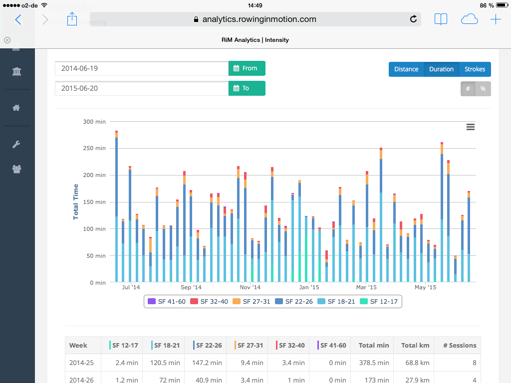
Not only does this serve as a motivating summary of your accomplishments, but this type of analysis is also very useful to control whether your actual training intensity is in accordance with your training plan. In addition to a chart display, you can find the data in a table representation below the chart as well.
Note
If you chose to display HR Intensity data, the zones in the title row reflect the Athlete’s current heartrate intensity zone thresholds. Entries in the table may have been calculated based on old zone data though!
Date Range
You can select a custom date range for your report. The start and end dates are only used to determine the start and end week, so we suggest you stick to Mondays only.
Absolute/Relative
You can change the chart display from absolute numbers to percentages with the toggle button on the top right corner.
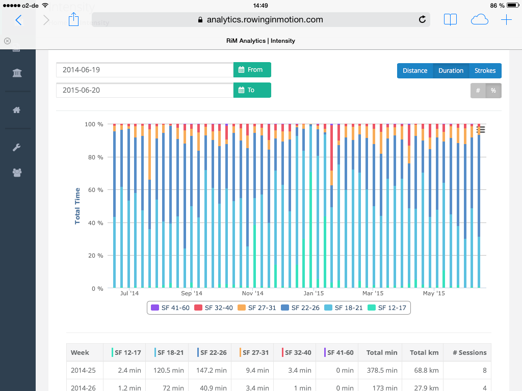
This will show you the relative proportion of the different intensity zones in your training. This type of analysis is particularly suited to check whether your taining periodization throughout the season is going to plan.
Aggregate Metric
As with workout intensity diagrams for individual rowing sessions, you can change the aggregate metric displayed on your intensity report to one of Distance, Time, Strokes.